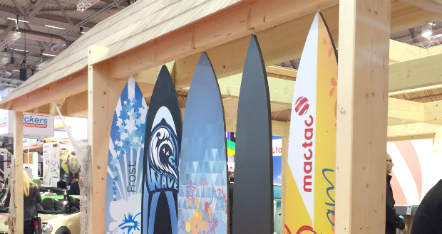
Mactac has unveiled a new logo, which the company says, “better reflects its values in a constantly changing world.”

Mactac wants its customers to see an innovative brand
Denise Nathan, marketing manager for mactac in New Zealand, says, “For over 50 years, mactac has built its reputation on innovative, reliable products that are appreciated for their performance in a range of applications. As a true driver of innovation, Mactac puts its customers and their needs at the heart of its development strategy, offering them new market opportunities.”

Denise Nathan, marketing manager at Mactac
The logo will represent the company worldwide. She adds, “The logo is the visual representation of the company and its values and also has to convey its ability to adapt to market evolution.
Built around a circular icon that symbolises a ribbon of self- adhesive embracing a world in constant motion, the company has lightened the colours of the old logo to create a warmer and friendlier feel. Nathan says, “The font is bold and strong but the smooth, round letter edges suggest a more caring attitude. The designers have turned up the opening of the letter C, indicating mactac’s focus toward the future and symbolosing the coaters on mactac’s production lines by evoking a rotary wrapping motion and rolls of pressure sensitive adhesive.”
She concludes, “We are confident that mactac customers will see it as an innovative quality brand on which they can rely for their needs and especially for expressing their own creativity.”