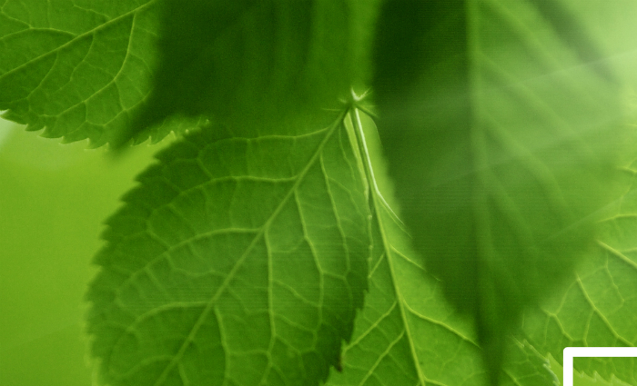
Global colour authority Pantone has selected its 15-0343 Greenery colour as the colour of the year selection for 2017.
Leatrice Eiseman, executive director of the Pantone Colour Institute, says, “While Serenity and Rose Quartz, the PANTONE Color of the Year 2016, expressed the need for harmony in a chaotic world, Greenery bursts forth in 2017 to provide us with the hope we collectively yearn for amid a complex social and political landscape. Satisfying our growing desire to rejuvenate, revitalize and unite, Greenery symbolises the reconnection we seek with nature, one another and a larger purpose.
“The tangy yellow-green speaks to our desire to express, explore, experiment and reinvent, imparting a sense of buoyancy. Through its reassuring yet assertive vibrancy, Greenery offers us self-assurance and boldness to live life on our own terms, during a time when we are redefining what makes us successful and happy.”
The company adds, “While often associated with environmentalism and nature, Greenery is also a unifying thread in tech and innovation because of its association with boldness, vigour and modernity. Many new apps, animation iconography and digital-first start-ups express this energy by using the riveting and attention-getting shade of green in their logos. Conveying progression and a pioneering spirit, Greenery portrays an entrepreneurial essence that aligns with the industries that have embraced it.
Pantone says the colour has found a prominent place with designers in fashion as seen in the recent collections of Kenzo, Michael Kors, Zac Posen, and Cynthia Rowley. It also advocates the colour for use in home décor and architecture; food and beverages; and graphic design.
Pantone says that its Colour of the Year has influenced product development and purchasing decisions in multiple industries, including fashion, home furnishings and industrial design, as well as product packaging and graphic design.
Greenery wins Pantone colour pick